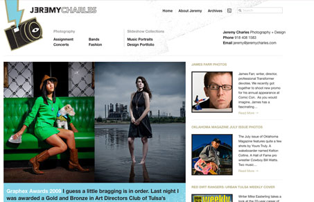
I like the vertical rhythm of this site, it seems “large” in it’s scale but it just flows really well to me. The large feature photo with the smaller thumbnails in the second column just works really well. Then the footer with the diagonal line really brings focus to the latest projects. Good looking layout here.
Glassmorphism: The Transparent Design Trend That Refuses to Fade
Glassmorphism brings transparency, depth, and light back into modern UI. Learn how this “frosted glass” design trend enhances hierarchy, focus, and atmosphere, plus how to implement it in CSS responsibly.


0 Comments