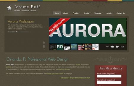
Great colors and great texture. When you mix those with really cool detail work, the flourishes and other interactive elements are great, you get a very nice website design. I could do without the over state animation for the main horizontal nav, i’m not a big fan of that type of interaction personally. But that’s really the only thing I can mention with this design, it really is great.
Glassmorphism: The Transparent Design Trend That Refuses to Fade
Glassmorphism brings transparency, depth, and light back into modern UI. Learn how this “frosted glass” design trend enhances hierarchy, focus, and atmosphere, plus how to implement it in CSS responsibly.


0 Comments