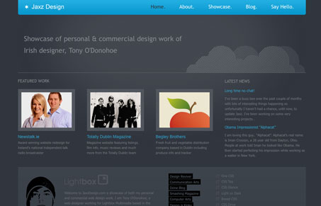
Great example of a well done dark-themed design. The blue article titles and menu provide contrast from the background, but not in such a way that they are distracting, and the lighter gray text is readable without being eye-blindingly white. Also, the cloud graphic is just enough to make the design stand out while retaining it’s simplicity. I love how elegantly simple it is.
Glassmorphism: The Transparent Design Trend That Refuses to Fade
Glassmorphism brings transparency, depth, and light back into modern UI. Learn how this “frosted glass” design trend enhances hierarchy, focus, and atmosphere, plus how to implement it in CSS responsibly.


0 Comments
Trackbacks/Pingbacks