jaxvineyards.com

jaxvineyardscom

Pretty cool website concept, the super oversized image of the wine bottle is nice looking and makes me really want a taste… What’s here is the call to action is a little grayed out button with “browse” as the name on it. This loads a sort of tool-tip navigation when you mouse over it. Clicking that will spin the entire page behind it to load that particular sample page. Clever.

The type is really clean and gives me a feeling that this wine belongs to a modern connoisseur as opposed to an old school wine drinker. Which if you check out the wine bottle labels too you’ll see that same aesthetic there too.
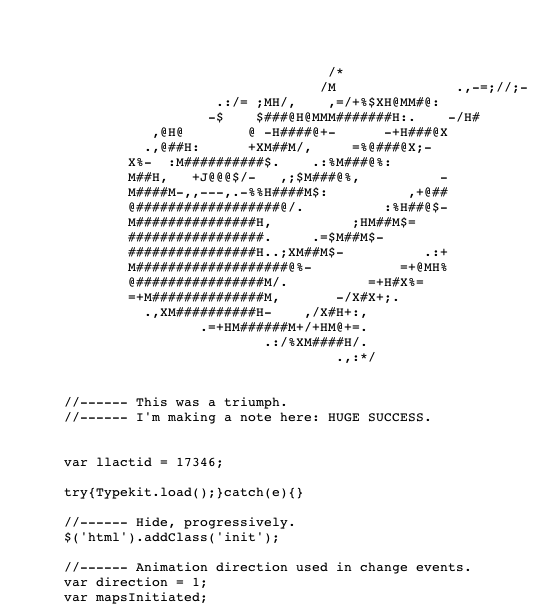
jaxcss

Love it when there’s some nifty CSS/ASCII stuff too.

2 Comments

  1. Gene Crawford

    That’s what that was from… thanks Octavio!

    Reply

Submit a Comment

Your email address will not be published. Required fields are marked *

News & Articles

Sign-Up: Enhancing Conversions through good UX

Sign-Up: Enhancing Conversions through good UX

Optimize your website’s sign-up process by focusing on clarity, ease, and user mindset. Clearly explain the purpose, benefits, and steps, and use social proof to build trust and drive conversions.

The Essential Guide to Getting Started on Freelance Writing

The Essential Guide to Getting Started on Freelance Writing

Explore the lucrative and fulfilling world of freelance writing with our essential guide. Learn about specialties like blogging, social media, article, and technical writing. Build a portfolio, find work, set up your business, and discover the potential earnings. Embrace the freedom of working from home and follow tips for success in your dream career.