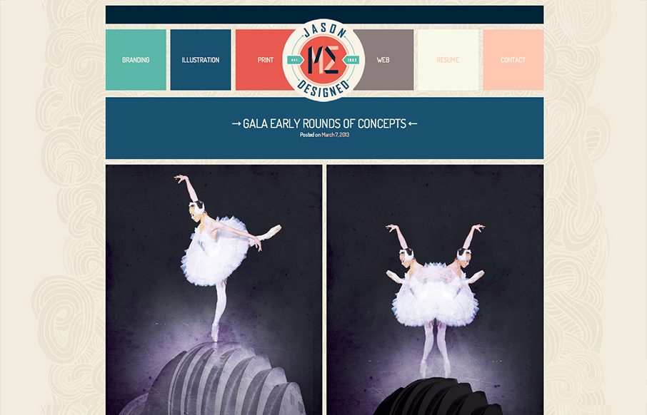
Overall pretty simple design. I just like scrolling and looking through the work, in a way it’s almost minimal in this aspect, but the color palette is pretty expansive so i’m not quite sure I can give it that moniker. It scales down to support smaller screen widths, but I almost feel like the desktop and mobile navigation designs should be flip flopped. What do you think?


Glassmorphism: The Transparent Design Trend That Refuses to Fade
Glassmorphism brings transparency, depth, and light back into modern UI. Learn how this “frosted glass” design trend enhances hierarchy, focus, and atmosphere, plus how to implement it in CSS responsibly.


I agree, the buttons would look much nicer in the bix versions on mobile