
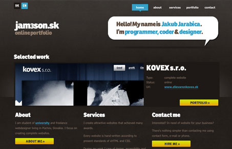
This site isn’t too deep on content, but overall it has a nice quality. I like the way the portfolio is organized as well. I’d like to see a footer on the site, but that’s just my opinion.


Fitts’s Law: Why the Easy Button Wins
Large, close targets are faster to hit than small, distant ones, that’s Fitts’s Law. A look at the 1954 rule behind buttons, prime and magic pixels, thumb zones, and dark patterns.


You’re right. It definitely needs a footer. He can get away with it (somewhat) on the other pages, but the home page with it’s columns all different heights really looks unfinished without a footer along the bottom.
Yep, footer:) Homepage is the only page where I don’t miss footer, when guest reaches bottom, he can(had to) choose one from big nav. buttons… But when I got some nice creative idea for footer, I’ll definitely do one. Ad content: right now I don’t feel it is necessary as it is mainly for presentational purposes, when I’d want to reach some clients, I plan to build it more comprehensive(lots of subpages) with better provided examples + case studies.. And thanks for reviewing 🙂
Good looking site Jakub, apparently we all just want more of it!