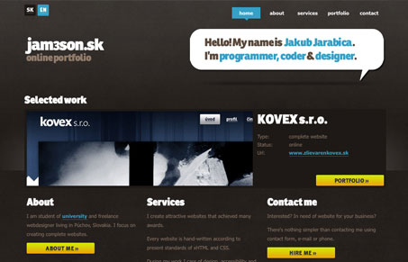
This site isn’t too deep on content, but overall it has a nice quality. I like the way the portfolio is organized as well. I’d like to see a footer on the site, but that’s just my opinion.
Glassmorphism: The Transparent Design Trend That Refuses to Fade
Glassmorphism brings transparency, depth, and light back into modern UI. Learn how this “frosted glass” design trend enhances hierarchy, focus, and atmosphere, plus how to implement it in CSS responsibly.


You’re right. It definitely needs a footer. He can get away with it (somewhat) on the other pages, but the home page with it’s columns all different heights really looks unfinished without a footer along the bottom.
Yep, footer:) Homepage is the only page where I don’t miss footer, when guest reaches bottom, he can(had to) choose one from big nav. buttons… But when I got some nice creative idea for footer, I’ll definitely do one. Ad content: right now I don’t feel it is necessary as it is mainly for presentational purposes, when I’d want to reach some clients, I plan to build it more comprehensive(lots of subpages) with better provided examples + case studies.. And thanks for reviewing 🙂
Good looking site Jakub, apparently we all just want more of it!