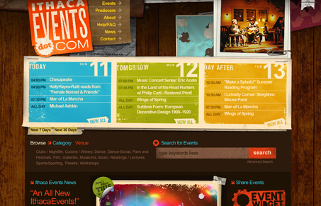
ithacaevents.com’s home page is very active. To a large extent, I think this is handled pretty well. The color palette is rich and varied without looking clownish, the typography is simple and contemporary, and a fairly well established visual hierarchy has created a fine distinction between the major content areas. The wood panel background provides a great textural backdrop to an already visually heavy (highly developed and texturally rich) site. So, Itheacaevents has all that going for it.
That being said, the main navigation is pretty lost in an extremely active header. I think that because the main nav is simply type it doesn’t utilize the visual language of a ‘button’ on the web. This has caused the nav read more like a design element than an interactive element. There is something to be said for buttons that look like buttons. Every other interactive area is pretty well differentiated through hierarchy and whitespace. Its only in the header nav that this visual disconnect exists. Also, the type looks a little too tight. I see that the letter-spacing was intentionally adjusted but in some places there is literally no space between letters (I looked at Chrome, Firefox, and Safari on a Mac). Its a quick fix and loosening up the type might make it a little easier to read.
Other than that, I think this is a very fine site, both colorful and exciting. Its upbeat mood is inviting and, except for the header, its a shining example of well integrated graphics and content. The snapshot that switches out every time the page loads is a nice touch.


0 Comments