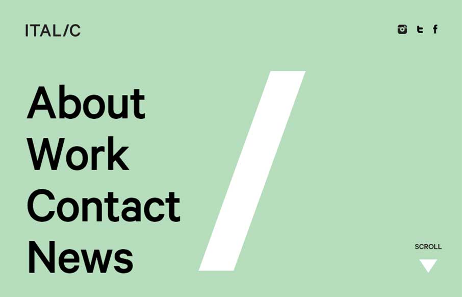
The more I played with the Italic Studio website, out of Los Angeles, the more I really dig it. The whole work on the About / Home page is cool and fairly seamless. Their Work is pretty darn good too – I remember seeing the Reebok Rally women’s magazine / catalog when it came out – great great work.
Glassmorphism: The Transparent Design Trend That Refuses to Fade
Glassmorphism brings transparency, depth, and light back into modern UI. Learn how this “frosted glass” design trend enhances hierarchy, focus, and atmosphere, plus how to implement it in CSS responsibly.


0 Comments