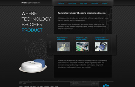
I like the little line based illustration work across this website, it reminds me of one of those technical drawing notes areas. The dark background works pretty well for the feel of this site too, that is selling the heavy technical side of the company. I like the dark and blue mixed with the white like this too. I also really like the tab area looking thing in the middle of the page.


0 Comments