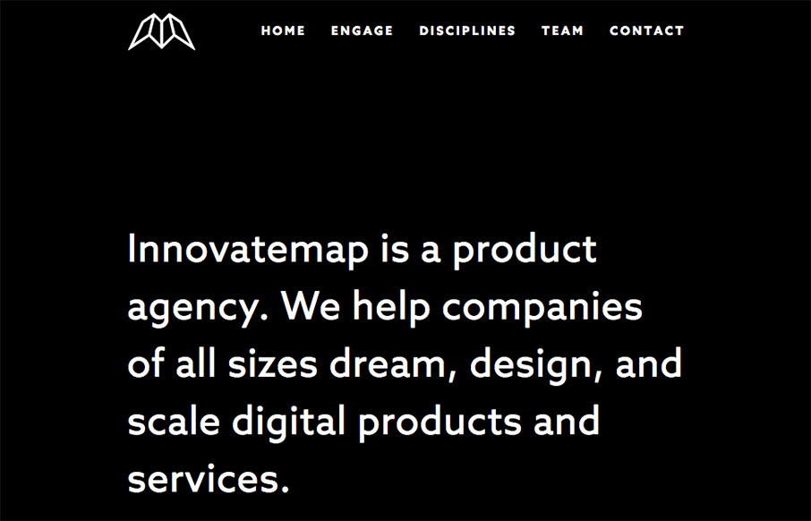
Innovatemap

http://www.innovatemap.com/

Man what a cool website. I love when things can be simply and easily communicated without much fuss (interaction/animation/crazy) and this site does just that. With visual pacing, clever graphic design and layout the Innovatemap site just drives along where it needs to go. Without fuss, but with a great deal of visual impact.

We recently rebranded our company, from the color palette to the fonts and brand voice. The site is largely black and white, except for our three branded icons, each representative of our three product disciplines. The deliberate use of color ensures that users are drawn to our work samples and calls-to-action (like links). Bold statements are informative and infused with team culture so readers get a sense of our professionalism and personality.

0 Comments

Submit a Comment

Your email address will not be published. Required fields are marked *

News & Articles

Looking Fast: The Art of Website Speed Perception

Looking Fast: The Art of Website Speed Perception

In the web world, technical speed and user perception matter. By improving design for a faster appearance, you boost conversions and stand out online. Speed isn’t just loading time; it’s perception.

Designing for Errors: Creating User-Friendly Contingency Plans

Designing for Errors: Creating User-Friendly Contingency Plans

Contingency Design hinges on empathy, understanding user frustration, and transforming errors into positive impressions. By embracing these principles, you enhance user experiences, retain customers, and boost revenue in the competitive digital landscap