
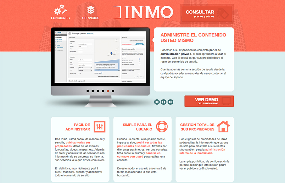
There’s not a ton of interactivity or special effects going on with this design, it’s just a nice reminder for me that you can always make a nice solid simple design in and of it’self. I love the crisp icon/illustration work for the nav items and that header with the background image and calls to action on the page are just nice.


Fitts’s Law: Why the Easy Button Wins
Large, close targets are faster to hit than small, distant ones, that’s Fitts’s Law. A look at the 1954 rule behind buttons, prime and magic pixels, thumb zones, and dark patterns.


0 Comments