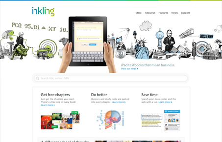
A very cool slideshow design is the heart of this website design. Such a nice take on how to use the slideshow element. It just draws you in. Overall too the info given on the page is kept to just what needs to be shared, beautiful. I also like the other details across the site, like the little interactions on the features page. Such a nice site.
Glassmorphism: The Transparent Design Trend That Refuses to Fade
Glassmorphism brings transparency, depth, and light back into modern UI. Learn how this “frosted glass” design trend enhances hierarchy, focus, and atmosphere, plus how to implement it in CSS responsibly.


Brilliant on many levels. The overall design matches Apple, which is great because it gives them some credibility but also because they actually sell a product that is really hand in hand with Apple. The sliding background has texture and depth. The images are illustrations with subtle color all syncing up with a common color theme. This enhances and reinforces the product they sell. The images are also very intellectual which matches the product. Vast amounts of white space give it a bookish feel.