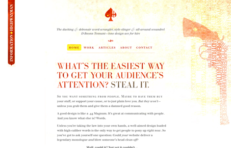
I love the visual subtlety and the not-so-subtle content paired together like this. The site is simple beautiful with the textures, colors and imagery all working together. I especially like the over state on the logo, surprising and almost hidden. This site doesn’t have a ton of variation as you drill deeper (I want more…) but what’s there is quite nice.
Glassmorphism: The Transparent Design Trend That Refuses to Fade
Glassmorphism brings transparency, depth, and light back into modern UI. Learn how this “frosted glass” design trend enhances hierarchy, focus, and atmosphere, plus how to implement it in CSS responsibly.


0 Comments