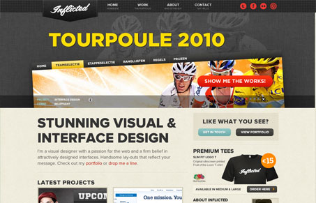
Nice well balanced design. It’s clean and professional and balances the typography and imagery well. The colors are also very subdued yet they aren’t corporate or boring. I like this style very much.
Nice well balanced design. It’s clean and professional and balances the typography and imagery well. The colors are also very subdued yet they aren’t corporate or boring. I like this style very much.


The Call to Action hasn’t changed in a decade, but the bar has. A fresh look at prominence, copy, mobile tap targets, and accessibility, with lessons from three major design systems.

Glassmorphism brings transparency, depth, and light back into modern UI. Learn how this “frosted glass” design trend enhances hierarchy, focus, and atmosphere, plus how to implement it in CSS responsibly.

Brutalism in web design rejects perfection for authenticity. Stark grids, raw type, and honest structure create interfaces that feel human, intentional, and impossible to ignore. Break the rules, on purpose.
0 Comments