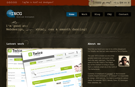
This is a really great looking site design, nice coloring, nice typography. It “feels” really finished. The very top header section is confusing and seems sort of out of place, with the star rating icons that don’t really do anything, the red does look good up there though.
Glassmorphism: The Transparent Design Trend That Refuses to Fade
Glassmorphism brings transparency, depth, and light back into modern UI. Learn how this “frosted glass” design trend enhances hierarchy, focus, and atmosphere, plus how to implement it in CSS responsibly.


0 Comments