
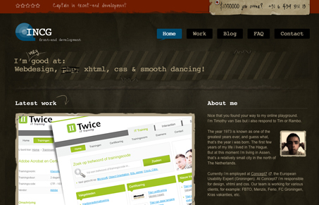
This is a really great looking site design, nice coloring, nice typography. It “feels” really finished. The very top header section is confusing and seems sort of out of place, with the star rating icons that don’t really do anything, the red does look good up there though.


Fitts’s Law: Why the Easy Button Wins
Large, close targets are faster to hit than small, distant ones, that’s Fitts’s Law. A look at the 1954 rule behind buttons, prime and magic pixels, thumb zones, and dark patterns.


0 Comments