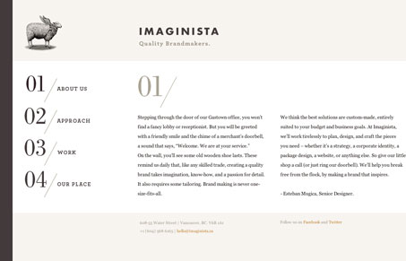
Really intriguing side scrolling design. Somehow I just enjoyed the narrative by scrolling across this site. I think a cool effect might be to make it move horizontally like it does as you use your mouse’s scroll-wheel to scroll down. I’ve seen that before and it could be a nice added UX detail. Overall it’s a nice clean design with nice photography. Lovely website.
Glassmorphism: The Transparent Design Trend That Refuses to Fade
Glassmorphism brings transparency, depth, and light back into modern UI. Learn how this “frosted glass” design trend enhances hierarchy, focus, and atmosphere, plus how to implement it in CSS responsibly.


Minimalism is great when it works. And here, it really does.
What is disappointing tho, is the horizontal scrolling. It is in my opinion not a natural way of browsing and it’s a distraction.
It can work to display work in a horizontal slider. But not with a horizontal scroll bar.
I was left wanting some different interaction with the horizontal scroll myself Emir. It’s okay to me that it scrolls like that but it just seemed too simple…