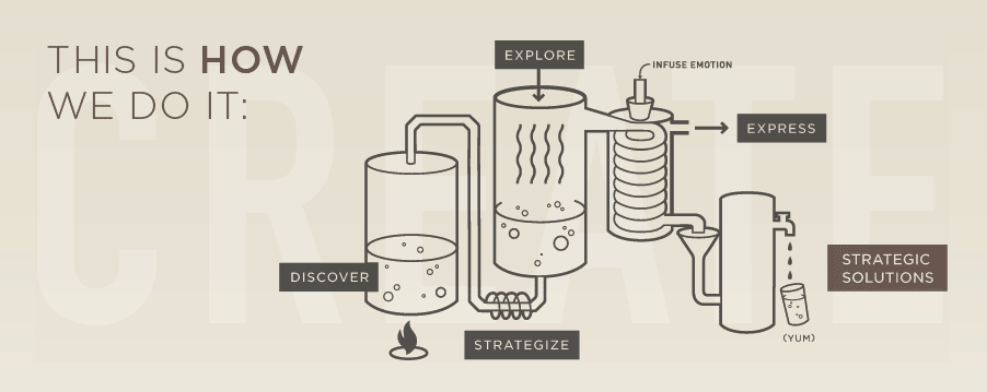
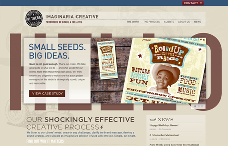
I like the tone of this website, the colors and the copy kind of go together. Really nice thorough-enough portfolio section too. I’m loving the process page graphic, the idea of taking your project and distilling it to a fine frosty beverage is a win in my book.


This site has nice muted colors and an interesting sense of humor. Well constructed vector graphics throughout add a nice touch to a subtle design and simple structure.
I agree with Gene about the process graphic; its charming and funny.
What’s also cool is how the blue is used here, it’s used in the opposite way i’m used to seeing blue. It’s like blue is the highlight color instead of the base.