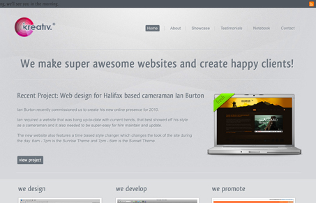
I like how the header strip fades a bit when you scroll the page, that’s a nice touch. The background looks good and keeping it static makes it really stand out as a design element all it’s own. There’s some readability issues for me with the dark type on a dark background down in the footer area. Overall though it’s a nice clean layout with a couple of little subtle surprises.
Looking Fast: The Art of Website Speed Perception
In the web world, technical speed and user perception matter. By improving design for a faster appearance, you boost conversions and stand out online. Speed isn’t just loading time; it’s perception.


0 Comments