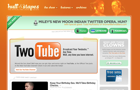
Huff and Stapes are, apparently, two guys who do some sort of comedy podcast and this is their fan site . There are a number of things that work well on this site, the hover navigation icons that give an indication that there is more than just a link is a good usability touch. There is a nice consistency to the icons and buttons. Whether they’re flat or not, they still work together. And I really like the episode navigation on the right hand side of the archives page, it’s a good way to present a lot of content in a small area.
Although there are a number of good things going on, the lack of visual movement on the home page really made it hard for me to take in the home page quickly. Basically, there’s two columns, and everything is generally horizontal and in a rounded box. These things are not necessarily bad things, but without any kind of element to break across these boxes, the eye tends to just stay in one place. As a result, I never really strayed away from the top right area, which currently says ‘Miley’s New Moon Indian Twitter Opera, Huh?’. Apparently this is their latest episode, which is fine and all, but without any visual cues to get my eye to move away and find out what else is going on, I just found myself very confused as to what this site actually was. So, even though there is plenty of good content on the home page, it’s important, as a designer, to make sure that the eye can be drawn around the page and that visitors can easily be led to the content you want them to see.


0 Comments