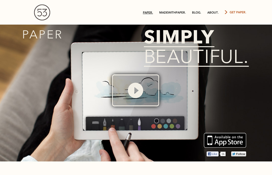
The Paper app home page is actually a sub page of the FiftyThree website. It’s gorgeously clean and simple though. I absolutely love how the images and copy flow down the page being strongly gridded out but yet almost asymmetrical at the same time.


The Call to Action, Revisited
The Call to Action hasn’t changed in a decade, but the bar has. A fresh look at prominence, copy, mobile tap targets, and accessibility, with lessons from three major design systems.


Looks beautiful 🙂 Is a web link available so I can take a look, or is it on the app site only?
Actually never mind, I found the link on Jason Santa Maria’s blog 🙂
http://www.fiftythree.com/paper
Your not alone in that frustration, that’s the one aspect unmatched is pretty bad about…