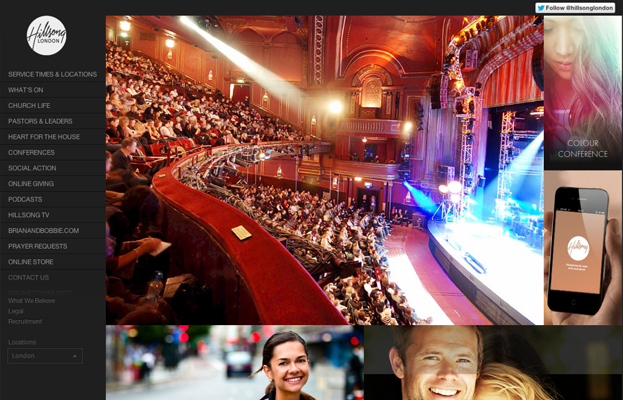
The thing I like most about this site is the extra wide screen size treatment, having the images fold out like one of those masonry type websites set’s this design off. I like how the images are also nav items and mostly mirror the navigation on the left. The sub sections feel like things jump around a good bit from page to page, that’s likely just part of the way it’s put together, the home page is very powerful visually though.
Looking Fast: The Art of Website Speed Perception
In the web world, technical speed and user perception matter. By improving design for a faster appearance, you boost conversions and stand out online. Speed isn’t just loading time; it’s perception.


0 Comments