hha.no

hhano

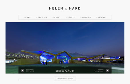
I always like a good website for an architecture firm. It’s clean and crisp and makes me think it’s Scandinavian, oh yeah, it is. I particularly like how the visual hierarchy is so self-evident, you go from super huge image to smaller boxes of older news. The news boxes load pretty dynamically when you click the “more news” at the bottom of the page too. Then as you make your way through the sub pages it’s all broken up with circles of images, very clever.

0 Comments

Submit a Comment

Your email address will not be published. Required fields are marked *

News & Articles

Looking Fast: The Art of Website Speed Perception

Looking Fast: The Art of Website Speed Perception

In the web world, technical speed and user perception matter. By improving design for a faster appearance, you boost conversions and stand out online. Speed isn’t just loading time; it’s perception.

Designing for Errors: Creating User-Friendly Contingency Plans

Designing for Errors: Creating User-Friendly Contingency Plans

Contingency Design hinges on empathy, understanding user frustration, and transforming errors into positive impressions. By embracing these principles, you enhance user experiences, retain customers, and boost revenue in the competitive digital landscap