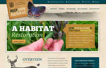
Julia and I reviewed this with a screen cast and we get into some detailed discussion about the design in it. Overall we both really liked this website. It’s one of the few single page scrolling sites we’ve both seen that we feel really fits and works with that style. The colors and illustrations really help tell the story of the habitat restoration concept. It’s very much a page that’s meant to engage with you visually and start kicking you off into other directions of education and with that goal it’s rather successful. We both give it a hearty thumbs up!
Glassmorphism: The Transparent Design Trend That Refuses to Fade
Glassmorphism brings transparency, depth, and light back into modern UI. Learn how this “frosted glass” design trend enhances hierarchy, focus, and atmosphere, plus how to implement it in CSS responsibly.


0 Comments