Submitted by Kark Digital Works
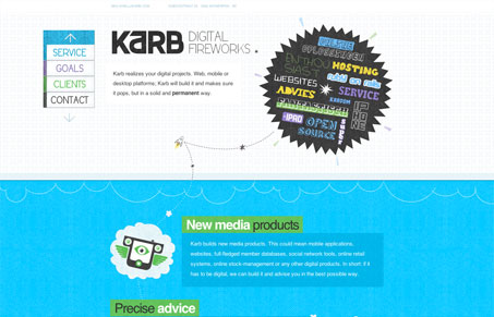
I think it’s nicely illustrated, the structure speaks for itself. Karb delivers digital products, they call it Digital Fireworks. From the bottom to the top you follow the way of the fireworks which explodes into this tagcloud of keywords for the company.
This site works so well because the illustrations are so rich and well done. It’s a fairly simple single page scroller site but on the surface it’s very nice to look at. I love the pipe/map like thing in the footer the most. The type choices give the site a nice feel too, very young and vibrant but sort of laid back too. Nice.


The textures and illustrations on this site work really well but I find the white text hard to read, and the spacing is little off. Perhaps a slightly larger font size would do the trick.
I always find white text on a dark background difficult to read. I mostly don’t like dark background sites with white text but i’m always excited to see ones that prove me wrong.