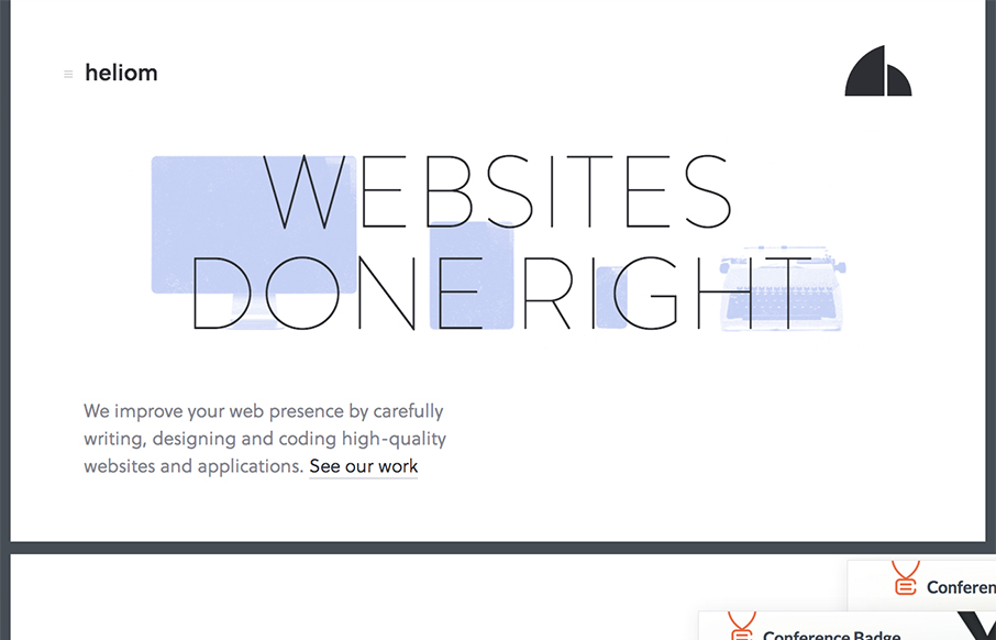
There are a ton of really great interactions both for desktop and mobile worked into the Heliom website design. The thing I love most about it is it feels very new, like new interactions for me. As I make my way through the different experiences on this site, from looking through screenshots on the home page and swiping the images on my iPhone sideways to get through them to the labs section and the blog articles focusing intensely on the copy itself. I’ve found all the pieces that make up this site elsewhere on other sites, but this one just wraps them up so nicely into a single bundle it makes me smile.
Microinteractions
Microinteractions are subtle site animations enhancing engagement. They include triggers, rules, feedback, and sometimes loops/modes. Practical uses: improving engagement, guiding user behavior. Well-designed microinteractions boost user engagement and your online presence.


There is no question that their design language is beautiful, the UX is a little bit off for me. Upon first look of the page, I feel like I’m looking at a PDF in the browser with the pure white body and thin, dark background. This is not bad, but when the project sections push past that border, I’m a little thrown off by this effect. Then after all the projects they switch off the card content and stick to the dark background.
Overall it is a unique and strong design but the mix of decisions for how content is displayed leaves me wondering, why?
I see what you are saying here and at the end I agree, it is a little too much of movement and too much of text inside more text that is the screenshot; it becomes a little overwhelming and the page ending effect. It would have been nice maybe to show the focus on the project when you hover or start scrolling but at the beginning they all kinda faded out so it doesn’t appear like too much content you have to keep track of…
Have you loaded it up on your phone? How does the experience compare across devices for you?
Yes I tried it out on my iPhone and, while the sliding of the content boxes is smooth and clean, the transition from their past work to their About section of the page is even more apparent in contrast of style. The background image in the intro to that section creates a barrier from the work to the people behind that work. I also wish some of their menu animations had a retracting animation as well, it’s so fluid on mouseenter but mouseleave is so abrupt. These are just little things that stick out to me.
That’s a nice comment on the mouseleave, I didn’t quite notice that myself.