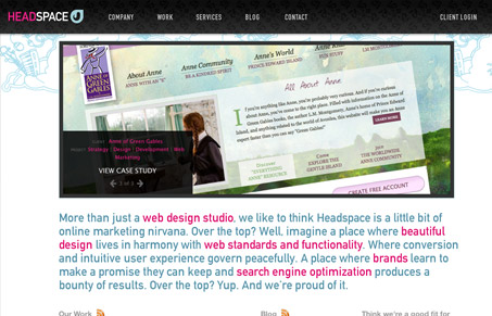
I like the open grid layout, the sketchy background imagery near the header. I also like the completeness of this site, the content is all there that needs to be there and it also has plenty of work to look through. There may be too much copy set in that large(ish) font on the home page, it’s a bit tedious to read. But overall this is a nice slick looking site.
Glassmorphism: The Transparent Design Trend That Refuses to Fade
Glassmorphism brings transparency, depth, and light back into modern UI. Learn how this “frosted glass” design trend enhances hierarchy, focus, and atmosphere, plus how to implement it in CSS responsibly.


0 Comments