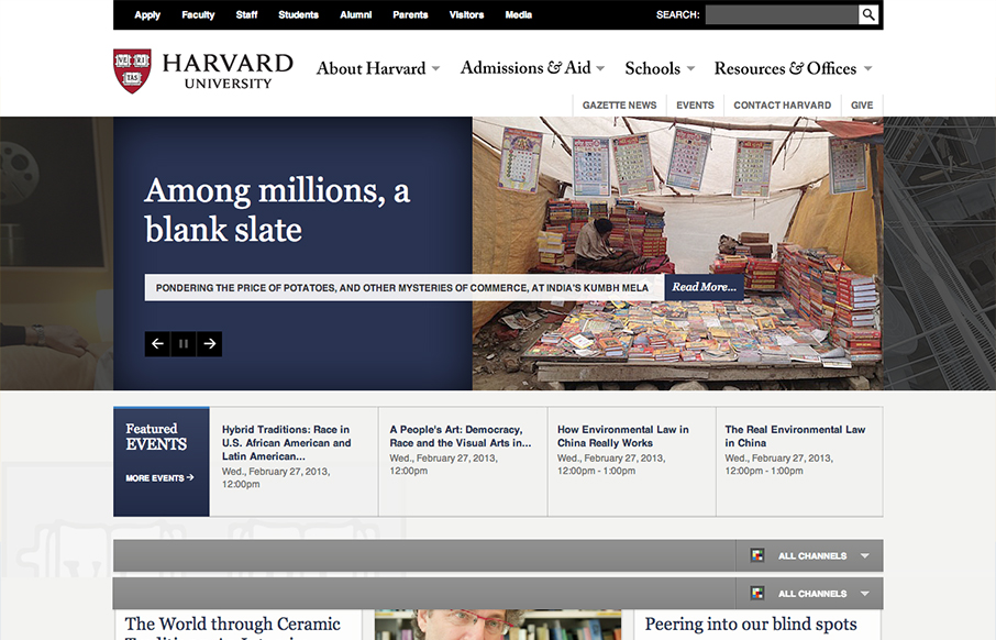
This is a well structured website. The grid is clear and easy to visually track the different sections of links. College websites are traditionally over-packed with links, this one is no exception but it’s designed in visual chunks so you can take it all in. I also particularly like the changes the site goes through as you get to the different targeted screen widths. The main nav is structurally much more defined as you get smaller and therefor get’s way more functional imho. Overall it’s a beautiful example of RWD for a large University.
Looking Fast: The Art of Website Speed Perception
In the web world, technical speed and user perception matter. By improving design for a faster appearance, you boost conversions and stand out online. Speed isn’t just loading time; it’s perception.


0 Comments