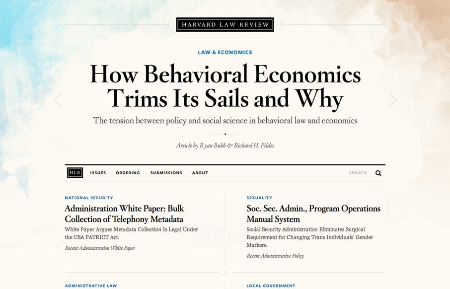
I wasn’t expecting to see something as remotely beautiful as the home page of the new Harvard Law Review site. It’s rich yet lean, and really pushes the limits of typography successfully. The background graphic elements frame the page nicely. It’s curious that the style among them changes from painterly to geometric. It doesn’t bother me, but I’d be interested to know if there was a specific intent there. Additionally, the small line flourishes add a detail that feels natural to a “lawyerly look” without going overboard in a Saul Goodman kind of way.
You lose a lot of the hierarchy and cleanliness when you get into a white paper page. (Where the sole purpose is to find a tiny PDF link to view any of the content) But, other pages throughout the site – article, search results, etc – carry out a very fresh layout & design. Overall this is beautiful, feels approachable, and should be commended.
Thanks to @chadengle for pointing the site out!


0 Comments