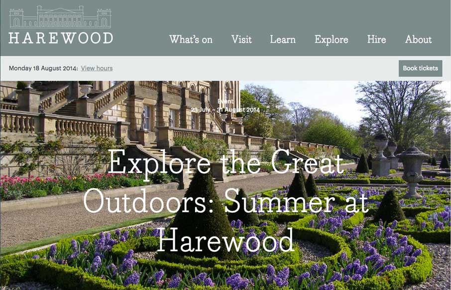
The Harewood site is a great example of how to deliver something that’s responsive and still have that “RWD look” but also elegant at the same time. I like a lot of this design and at the same time sniff several tried and true visual RWD patterns at work here.


The Call to Action, Revisited
The Call to Action hasn’t changed in a decade, but the bar has. A fresh look at prominence, copy, mobile tap targets, and accessibility, with lessons from three major design systems.


0 Comments