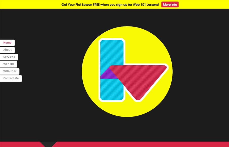
Interesting single pager. Chock full of bright colors and solid looking illustrations/icons. I like the fixed nav on the left, it’s a nav design i’ve seen before but it just looks like it fits here better than others. There are some sections where the black text on dark colored background gets hard to read but overall it’s contrasted enough across the site design to work out.
Looking Fast: The Art of Website Speed Perception
In the web world, technical speed and user perception matter. By improving design for a faster appearance, you boost conversions and stand out online. Speed isn’t just loading time; it’s perception.


0 Comments