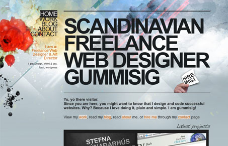
There’s several things in this design that really shouldn’t work, the super tight leading on the nav, overall the design has a rushed feel to it. But I just like this site design. I like the super tight leading on the nav, I think it’s actually a neat little effect when you mouse over a link. The background is sort of weird but it’s striking. Thw giant header text is really big but somehow it works for me. I also really like the way the blog posts are handled, breaking into the second row of the grid makes the layout feel a little exotic to me.
Glassmorphism: The Transparent Design Trend That Refuses to Fade
Glassmorphism brings transparency, depth, and light back into modern UI. Learn how this “frosted glass” design trend enhances hierarchy, focus, and atmosphere, plus how to implement it in CSS responsibly.


thanks for the review man, your spot on I think 🙂