
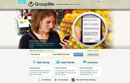
Really clean layout using a huge image of a shopper and a magnified view of the app’s interface to help tell the story. I like that design approach, it almost completes the story without having to explain it to me with copy. The design is simple and clutter free and feels quick to take in.




0 Comments