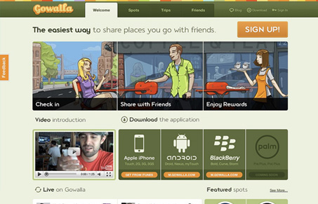
Jay and I both really like the new Gowalla site design. Get some more details in our screen cast review here.
Overall we love the changes, the lighter coloring, the section with the different platforms that you can download the app for and the “Live on Gowalla” section are really brilliant. The top three illustrations also all look really beautiful. We had some concerns over the use of the illustrations versus what they had prior with the straight up text description and some of the change of voice in the message. Going from an introductory tone to a comparative tone. Overall though, the site is a real beauty visually.


0 Comments