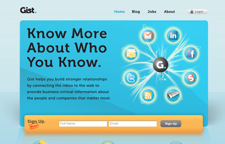
Great simple looking site. I love the colors and the sign up form fields are very well placed and focused on. Nice touches on the interactions like the video/tour, etc. Good looking product site!
Glassmorphism: The Transparent Design Trend That Refuses to Fade
Glassmorphism brings transparency, depth, and light back into modern UI. Learn how this “frosted glass” design trend enhances hierarchy, focus, and atmosphere, plus how to implement it in CSS responsibly.


It’s sooooo close. The absurd reflections kill it for me. That and the overuse of Museo, aka the hardest working font in Web 2.0
Is it really possible to overuse Museo though?
I think it’s poorly suited for the smaller sizes on that site. It looks muddy and poorly aliased.