
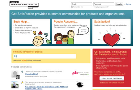
Here’s the updated Get Satisfaction website. I think this is a huge improvement over the old design (which wasn’t that bad mind you.) The simplistic illustrations really stand out an give the site character, it’s overall much simpler and cleaner in what it’s asking you to do. Making the search prominent like that really puts the focus on people using the site to get into communicating with companies. The signup is very subtle, and the fact that the main call to action other than search is to just “learn more” is stellar.


Fitts’s Law: Why the Easy Button Wins
Large, close targets are faster to hit than small, distant ones, that’s Fitts’s Law. A look at the 1954 rule behind buttons, prime and magic pixels, thumb zones, and dark patterns.


0 Comments