getcorpus.com

getcorpuscom

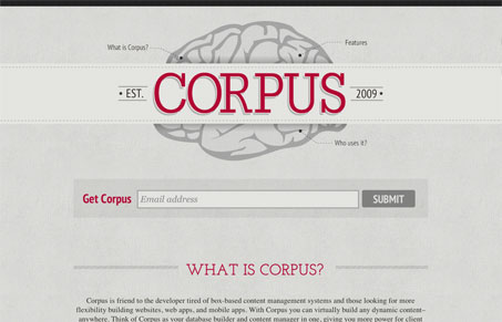
Love this almost minimal design. The textures, the illustration/icons, the colors they’re all pulled together to be one simple harmonious page. There’s just enough red to make certain features stand out just right. One thing is the small navigation items around the brain are kind of hard to pull out, I didn’t see them until the 3rd viewing of the page, also the call to action of “get corpus” and an email box next to it isn’t a pattern we’re used to seeing and leaves us thinking wth will happen next, wich isn’t good. Overall though it’s swift and concise on it’s design and I quite enjoy that brain icon/logo, super cool.

0 Comments

Submit a Comment

Your email address will not be published. Required fields are marked *

News & Articles

Looking Fast: The Art of Website Speed Perception

Looking Fast: The Art of Website Speed Perception

In the web world, technical speed and user perception matter. By improving design for a faster appearance, you boost conversions and stand out online. Speed isn’t just loading time; it’s perception.

Designing for Errors: Creating User-Friendly Contingency Plans

Designing for Errors: Creating User-Friendly Contingency Plans

Contingency Design hinges on empathy, understanding user frustration, and transforming errors into positive impressions. By embracing these principles, you enhance user experiences, retain customers, and boost revenue in the competitive digital landscap