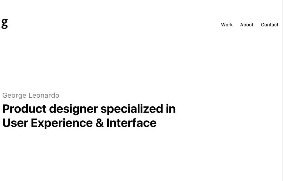
George Leonardo

http://georgeleonardo.com/

For being a seemingly minimal portfolio site from George Leonardo out of Brazil, it has some good, subtle pieces that add to it being a strong site. I was about to say today was black and white site day, but George had some hidden color in his tags leading to the Work pages – and I really like how the About page copy fades in at the bottom – nothing distracting, but cool little feature.

From the Designer: Product designer specialized in User Experience & Interface

Submitted by: George Leonardo
Twitter:
@georgeleonardo
Role: Designer
Country: Brazil

0 Comments

Submit a Comment

Your email address will not be published. Required fields are marked *

News & Articles

Sign-Up: Enhancing Conversions through good UX

Sign-Up: Enhancing Conversions through good UX

Optimize your website’s sign-up process by focusing on clarity, ease, and user mindset. Clearly explain the purpose, benefits, and steps, and use social proof to build trust and drive conversions.

The Essential Guide to Getting Started on Freelance Writing

The Essential Guide to Getting Started on Freelance Writing

Explore the lucrative and fulfilling world of freelance writing with our essential guide. Learn about specialties like blogging, social media, article, and technical writing. Build a portfolio, find work, set up your business, and discover the potential earnings. Embrace the freedom of working from home and follow tips for success in your dream career.