
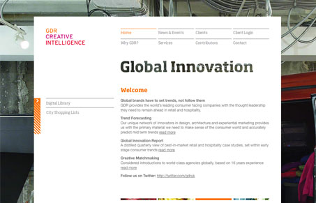
Nice looking simple layout, clean open design. I like the clear text effect that shows through the background behind the logo type. Pretty slick site all in all, it somehow looks very forward thinking yet old school design firm(ish) at the same time.




0 Comments