
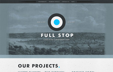
Super cool looking single page design. I really like the dark mood of the colors and the way the content is put together it really reads well and not too over the top like a lot of designer websites/portfolios. The copy is really what sells this site to me, specifically the ‘working with us’ section. The contact form is also pretty nicely styled, simple but nice. The the blog is quite different, yet sill holds true to the same aesthetic of the main website, solid work here.




0 Comments