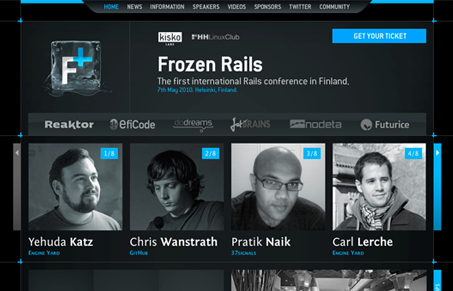
Man I love this design. It’s a dark background site which I don’t normally go for but this one just looks great. I love the “frozen” concept and the way the logo is worked up. The lines and corner graphics make this design really sing. It looks like a really awesome conference for Ruby/Rails development too.
Glassmorphism: The Transparent Design Trend That Refuses to Fade
Glassmorphism brings transparency, depth, and light back into modern UI. Learn how this “frosted glass” design trend enhances hierarchy, focus, and atmosphere, plus how to implement it in CSS responsibly.


0 Comments