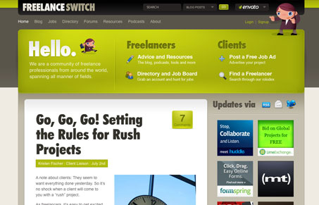
There’s a ton of stuff to review in the new Freelance Switch website, maybe it needs to go into the podcast, but here’s some quick observations:
I do really like this design, it’s very well done. It puts emphasis on the important parts of the page, the headers of the posts, amount of comments and the big section on the home page up in the header for “clients” and “freelancers” is very effective. I really love how they handled the comments section design on a post’s page, breaking it out like that makes it very obvious and really puts focus on reading through the comments. All things a blog owner really wants visitors to do.
There’s so many lessons to take away from picking through this design, I know i’ll be taking some ideas away for myself. What are some others that you see?


0 Comments