
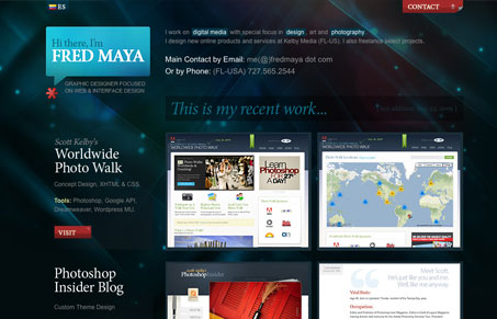
Really tight single page portfolio layout design. I really like the colors and rollover treatments. I like that the screen shots get some description next to them about what went into each, I never really love the lightbox effect, but this one has been customized to fit with the overall design, that’s always a nice detail. The “contact” scroll-out effect for the contact form isn’t the best part of this design, the “submit” button is just huge. Overall I like this single page site.


Fitts’s Law: Why the Easy Button Wins
Large, close targets are faster to hit than small, distant ones, that’s Fitts’s Law. A look at the 1954 rule behind buttons, prime and magic pixels, thumb zones, and dark patterns.


0 Comments