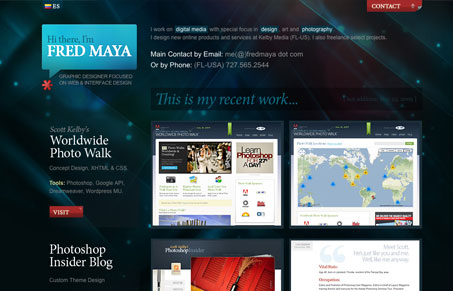
Really tight single page portfolio layout design. I really like the colors and rollover treatments. I like that the screen shots get some description next to them about what went into each, I never really love the lightbox effect, but this one has been customized to fit with the overall design, that’s always a nice detail. The “contact” scroll-out effect for the contact form isn’t the best part of this design, the “submit” button is just huge. Overall I like this single page site.
Glassmorphism: The Transparent Design Trend That Refuses to Fade
Glassmorphism brings transparency, depth, and light back into modern UI. Learn how this “frosted glass” design trend enhances hierarchy, focus, and atmosphere, plus how to implement it in CSS responsibly.


0 Comments