Submitted by: Matteo Montolli @zegiogroup
Role: Designer & Developer
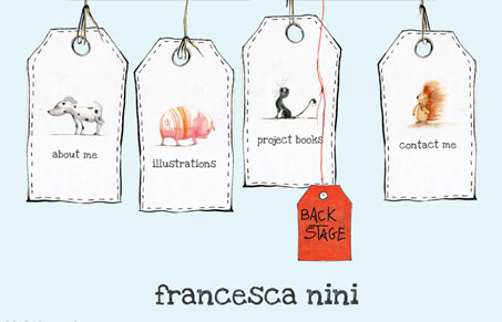
This is a great website! I love the super simple approach using the 4 tags and some animation to pull you in. The work is great and the elements of the website all match up with the artists style – like the X to close out the lightbox windows. It’s double super awesome to see it’s responsive too. That’s just rad here.


This site is so fun to look through! I forgot I was on a website! There’s tons of great work on a lot of details. So nice.