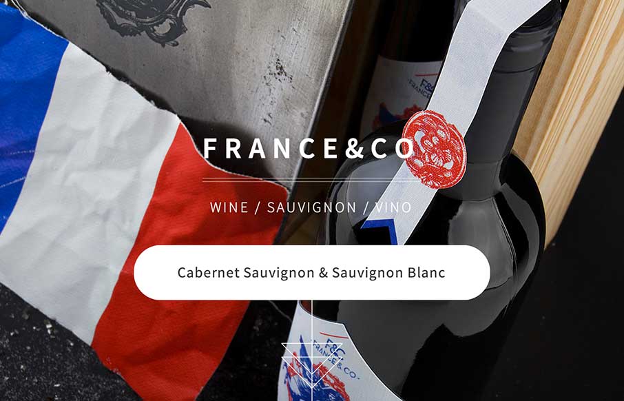
Looks like a simple site – but some nice background image, slight parallax feel in the scroll. A little confused on the copy translation and repeats, and the social icons that go nowhere. But the design itself is vibrant, and seems to get the brand’s image across as such.


The Call to Action, Revisited
The Call to Action hasn’t changed in a decade, but the bar has. A fresh look at prominence, copy, mobile tap targets, and accessibility, with lessons from three major design systems.


0 Comments