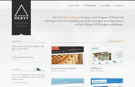
Small detail – that’s really what this site is. Now we’ve seen site’s that look similar to this layout right? But this one is just a little bit nicer than most and it’s the small details that finish it off. The flourishes after the separator lines, the little twitter icon/illustration and the animated effect on the logo when you mouse over it.
I also really love the “level of proficiency” being measured in mustaches, that’s how everyone should be compared from now on!


0 Comments