foothillsfallfestival.com

foothillsfallfestivalcom

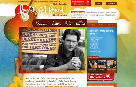
Really intense design for the foothillsfallfestival.com site. The colors & textures have been superbly chosen to reflect the fall. The background animation of the clouds is also pretty cool. This is just a site that has so much character it’s hard to not notice it. With all that, it is borderline too much though. It’s like one of those pages where every other word has been bolded, you know where if everything is bold nothing stands out from the rest of the copy. There’s just so many nice little (and large) details to take in your eye goes all over the page. Love the detail work tremendously here though.

0 Comments

Submit a Comment

Your email address will not be published. Required fields are marked *

News & Articles

Looking Fast: The Art of Website Speed Perception

Looking Fast: The Art of Website Speed Perception

In the web world, technical speed and user perception matter. By improving design for a faster appearance, you boost conversions and stand out online. Speed isn’t just loading time; it’s perception.

Designing for Errors: Creating User-Friendly Contingency Plans

Designing for Errors: Creating User-Friendly Contingency Plans

Contingency Design hinges on empathy, understanding user frustration, and transforming errors into positive impressions. By embracing these principles, you enhance user experiences, retain customers, and boost revenue in the competitive digital landscap