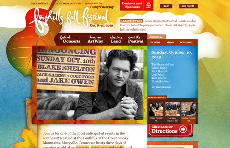
Really intense design for the foothillsfallfestival.com site. The colors & textures have been superbly chosen to reflect the fall. The background animation of the clouds is also pretty cool. This is just a site that has so much character it’s hard to not notice it. With all that, it is borderline too much though. It’s like one of those pages where every other word has been bolded, you know where if everything is bold nothing stands out from the rest of the copy. There’s just so many nice little (and large) details to take in your eye goes all over the page. Love the detail work tremendously here though.
Glassmorphism: The Transparent Design Trend That Refuses to Fade
Glassmorphism brings transparency, depth, and light back into modern UI. Learn how this “frosted glass” design trend enhances hierarchy, focus, and atmosphere, plus how to implement it in CSS responsibly.


0 Comments